Branding and visual identity
An identity must do more than get noticed. It must be built to last.
We build visual systems capable of recognising an organization at every point of contact.
Our approach
Before the logo comes a position to make visible.
An effective identity does not begin with the search for a memorable shape. It begins with what the organization stands for, who it speaks to and how it wants to be recognized over time.
We focus positioning, personality and language; then we transform these choices into a system of signs, colors, characters, images and rules. The result is not an image to protect, but a tool that helps communicate, choose and produce consistently.
What we build
Everything that makes a brand recognizable and usable.
Strategy and application proceed together: each choice must be able to become a concrete tool for those who communicate.
- 01
Strategy and positioning
Purpose, public, differences and personalities define the territory that the brand can occupy.
- 02
Naming and architecture
Names, lines, products and relationships are organized in an understandable and scalable system.
- 03
Visual identity
Mark, typography, color, images and signs build a distinctive and consistent language.
- 04
Brand guidelines
Rules, examples and tools make the identity applicable by teams, partners and suppliers.
- 05
Editorial systems
Catalogs, company profile, reports and documentation transform complex content into legible publications.
- 06
Evolution and governance
Templates, updates and quality control keep the brand alive on different channels, markets and languages.
The process
From the desired identity to a working system.
Each stage clarifies a decision and translates it into something that the organization can really use.
- 01
Understanding
We listen to the organization, the market, people and what the brand has to make credible.
- 02
Define
We build positioning, personality, messages and principles that guide creative choices.
- 03
Drawing
We develop signs, visual language and applications by verifying them in real contexts.
- 04
Make operational
We deliver rules, templates and tools and accompany the system in its evolution.
A system, not a signature
A brand becomes strong when it manages everything it produces.
From the business card to a catalog of eighty pages, from the technical sheet to the company profile, each content adds or removes something to the brand's perception. Consistency does not always mean repeating the same composition: it means having rules clear enough to deal with different contexts without losing identity.
This is why we design language and tools together. A palette must work on print and digital, a typographic hierarchy must hold more languages, a photograph must tell both the organization and the product.
Identity must accompany an organization as it grows.
For Coltri the system extends from the brand manual to corporate narrative, from catalogues to product cards and technical documentation in multiple languages. The force is not in a single elaborate, but in the continuity between history, product, commercial network and assistance.

The strategy becomes recognizable when it takes shape.
Missions, vision and values must not remain introductory pages of a manual. In the BluVaro system they guide the construction of the sign, the relationship between light and depth, the palette, typography and how the brand enters the spaces and the tools of work.

Architecture and content
Different brands can belong to the same system without resembling it.
Groups, divisions and products often have different publics and personalities. The brand architecture establishes what must be shared and where each identity must instead find its own space, avoiding both fragmentation and artificial uniformity.
The same principle applies to publications: a sustainability budget, a catalogue and a technical manual have different functions, but they can express the same culture through hierarchy, rhythm, images and editorial quality.
Give a legible form to corporate responsibility.
In the work for the Vezzola group, the construction of dedicated identities coexists with an editorial system able to tell data, people, territory and sustainability. Design organizes dense content without impoverishing them and makes recognizable the relationship between different activities.

A visual language can also explain complex products.
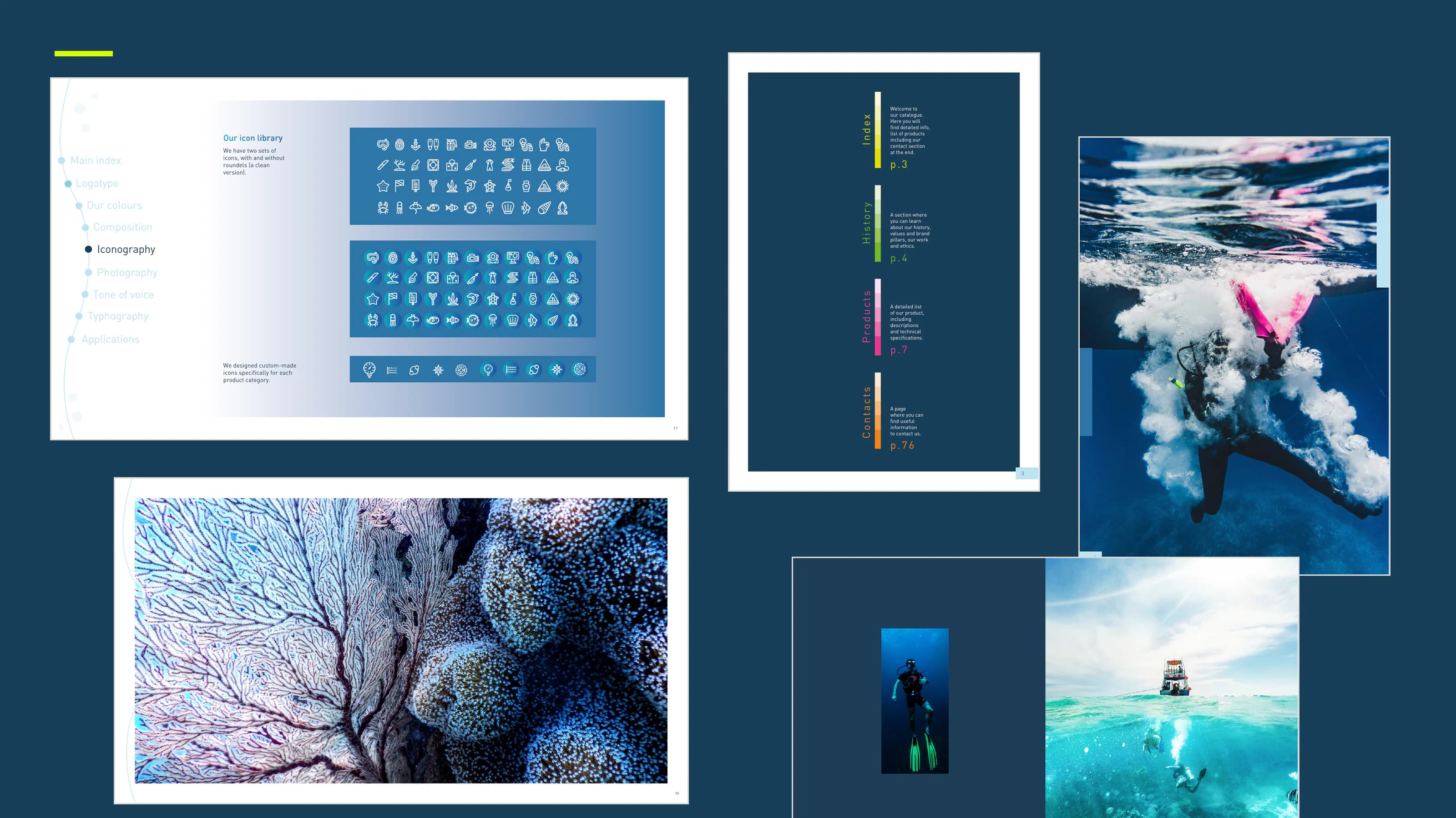
For Termo Industry colors, photos, icons and illustrations build a technical imagination linked to the underwater world. The same rules cross the brand manual and catalog, orienting between families, features and applications without sacrificing personality.
After the manual
Identity is not simply delivered. It is designed to keep living.
A brand manual is only useful if it helps make decisions. This is why we support examples, templates and production systems, and we can continue to follow catalogues, documentation, campaigns and new contact points.
The brand remains so consistent without becoming rigid: recognizable today, ready to accept what the organization will be tomorrow.
Let’s build something useful.