
Project
BluVaro
A visual identity to tell the convergence between lean manufacturing, digital transformation and artificial intelligence.
Client
BluVaro
Period
2025
Category
Branding
Brand identity for the industry that evolves
Operational excellence needed a live sign.
BluVaro supports manufacturing companies in process improvement, digital transformation and advanced technologies. The project of identity had to make this convergence recognizable without looking either a traditional consultancy company or a technological brand distant from people.
We have transformed mission, vision and values into a visual system capable of talking about efficiency, movement and connection. The result is not only a brand: it is a grammar that can be used on commercial tools, environments, digital channels and daily communication.
Ambito
Brand strategy and visual identity
Sector
Lean, digital transformation and AI
Output
Brand and brand manual
System
Print, environments and social
Year
2025
Three words had to hold factory, data and people together.
Lean. Digital. Excellence.” was not treated as a simple payoff. Lean represents the rigour of continuous improvement; Digital the ability to transform processes and decisions; Excellence is the measurable result produced by the encounter between people, technology and organization.
Efficiency, innovation, sustainability, collaboration and human-centered technology have defined the scope of the project. Before the shape we built a direction: authoritative for the industrial world, contemporary to talk about AI and human enough to communicate partnership.
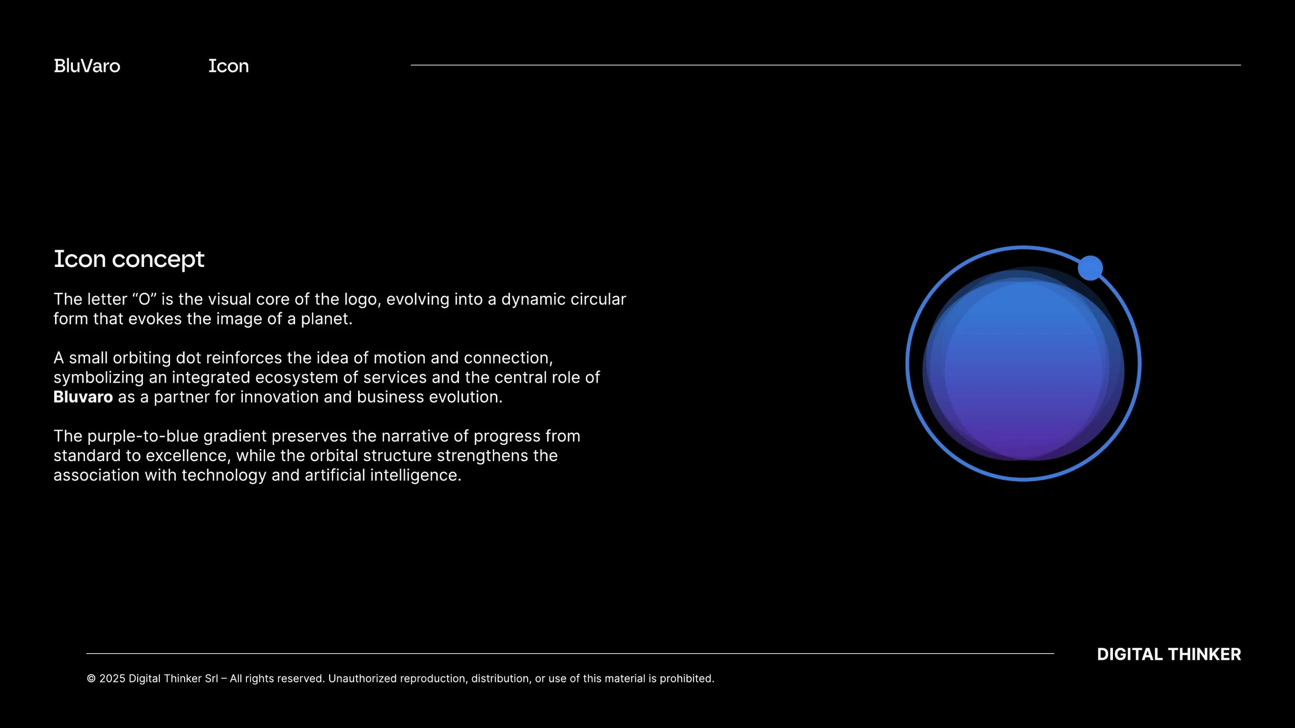
An orbit transforms the last letter into an ecosystem.
The “O” becomes the visual center of the brand: a circular shape that recalls a planet, surrounded by a point in orbit. Movement and connection tell a system of integrated services and BluVaro's position as a partner of corporate evolution.
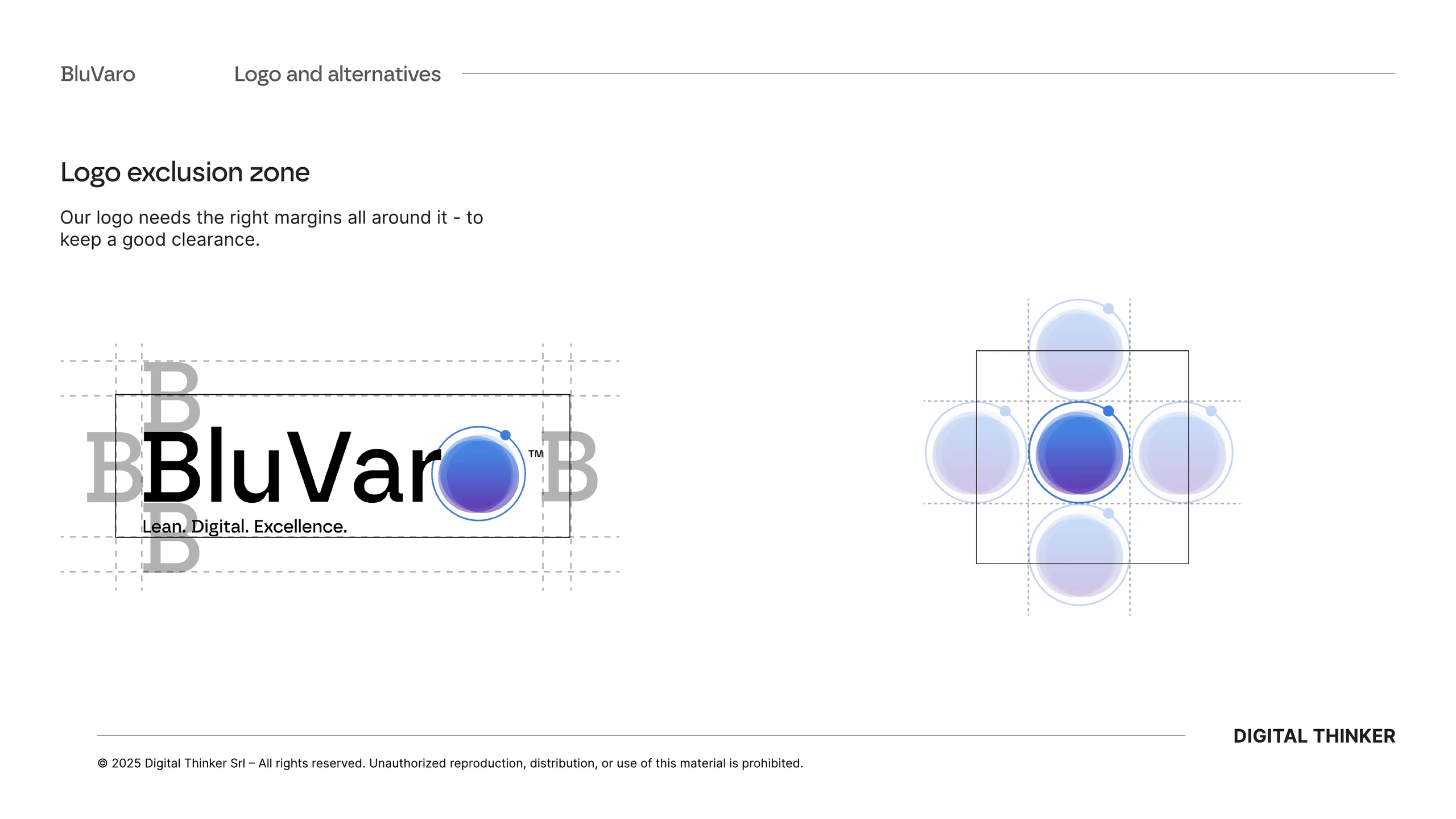
The gradient from blue to purple introduces depth and makes the transition visible from standard to excellence. Proportions, respect area, minimum dimensions and variants ensure that the sign maintains precision and recognisability in the most different contexts.
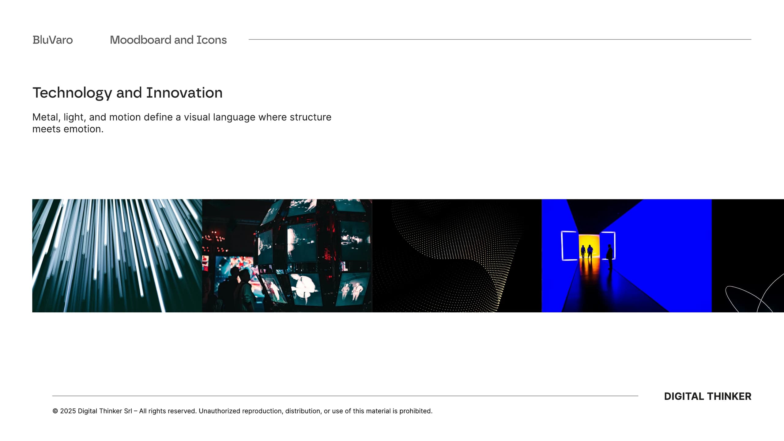
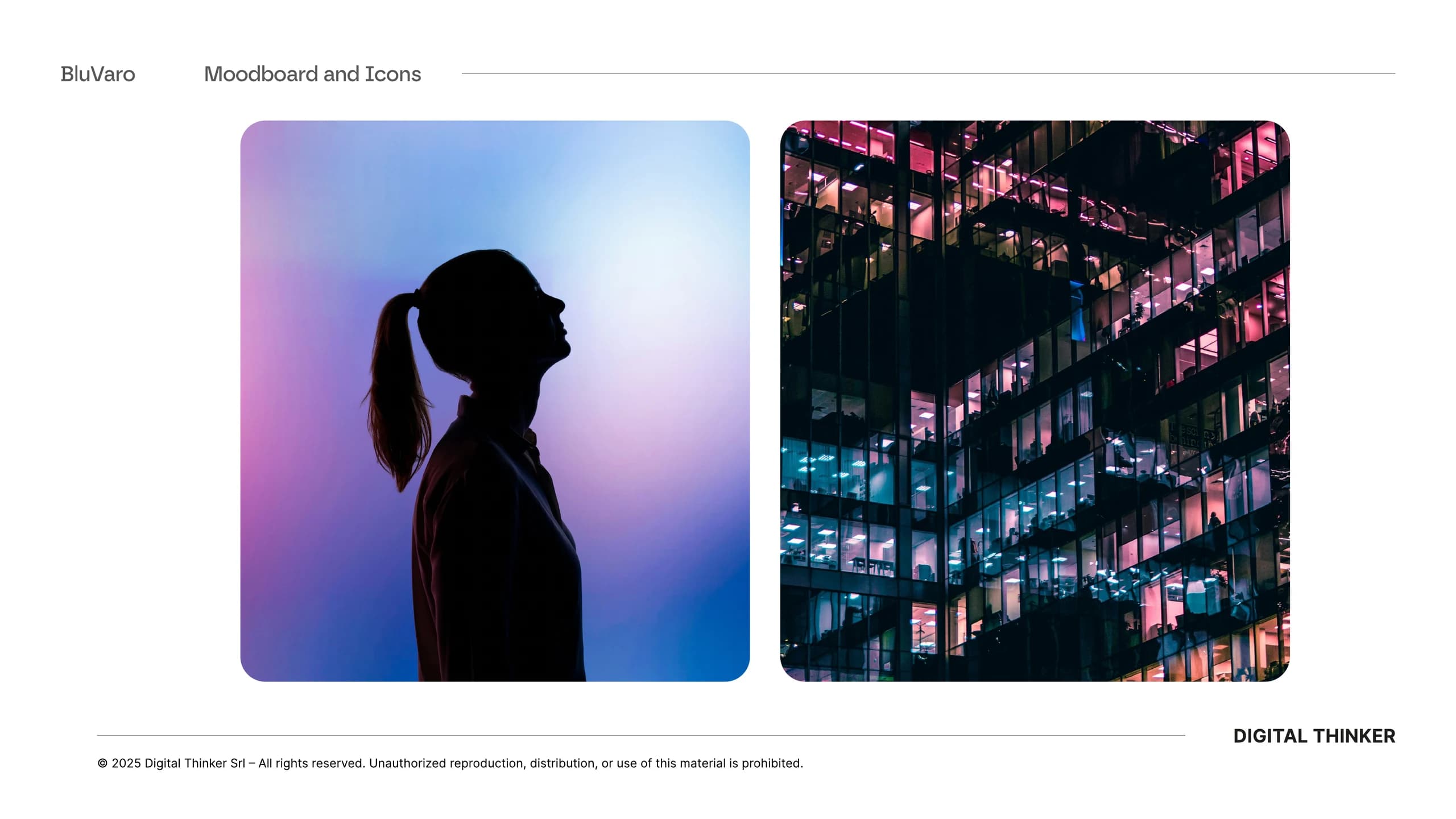
Technology acquires depth without losing clarity.
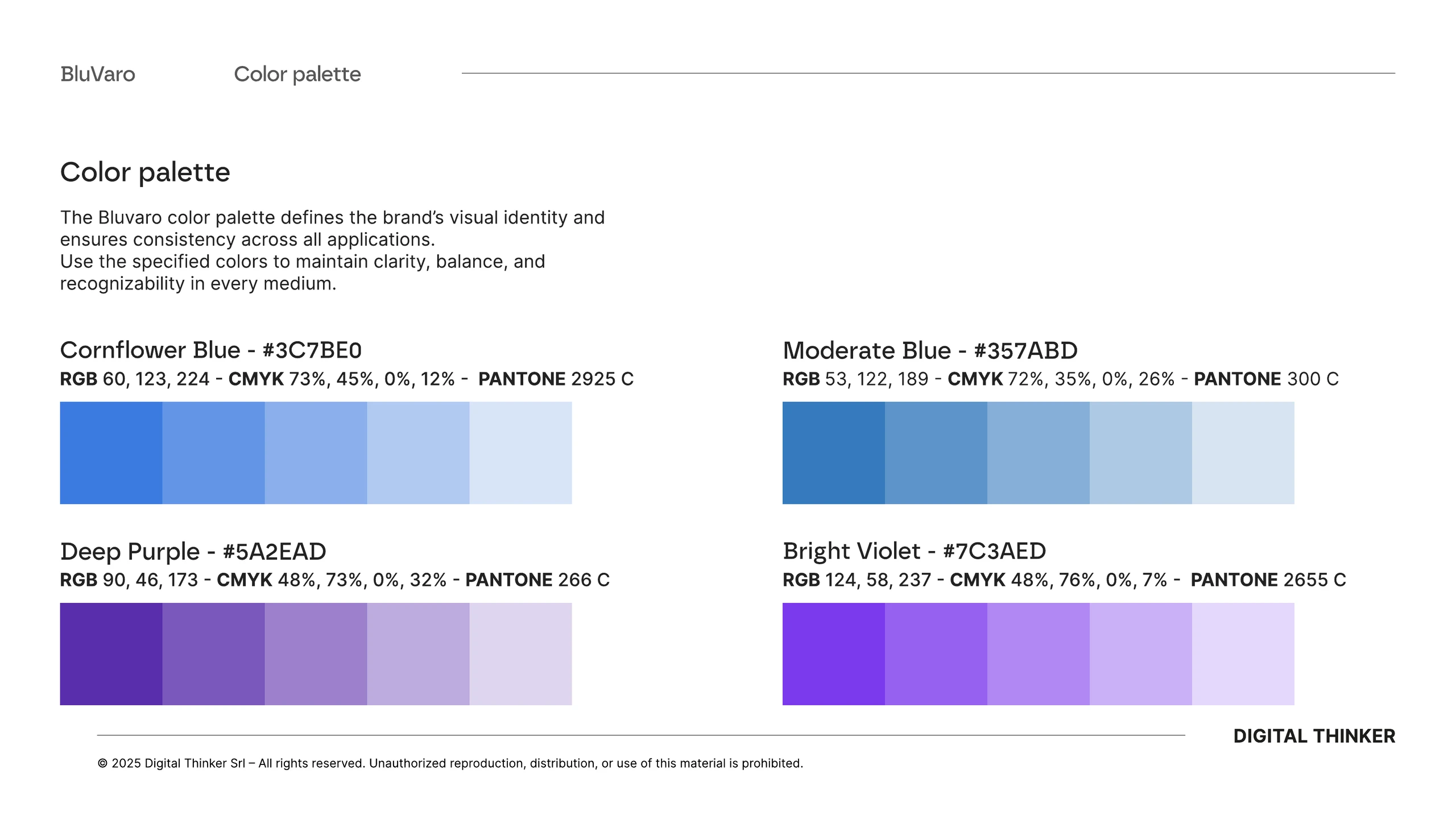
The palette combines blue, moderate blue, deep purple and bright violet with an extended base of black, white and gray. The color remains a controlled accent: quite distinctive to build memory, never so invasive to compromise readability.
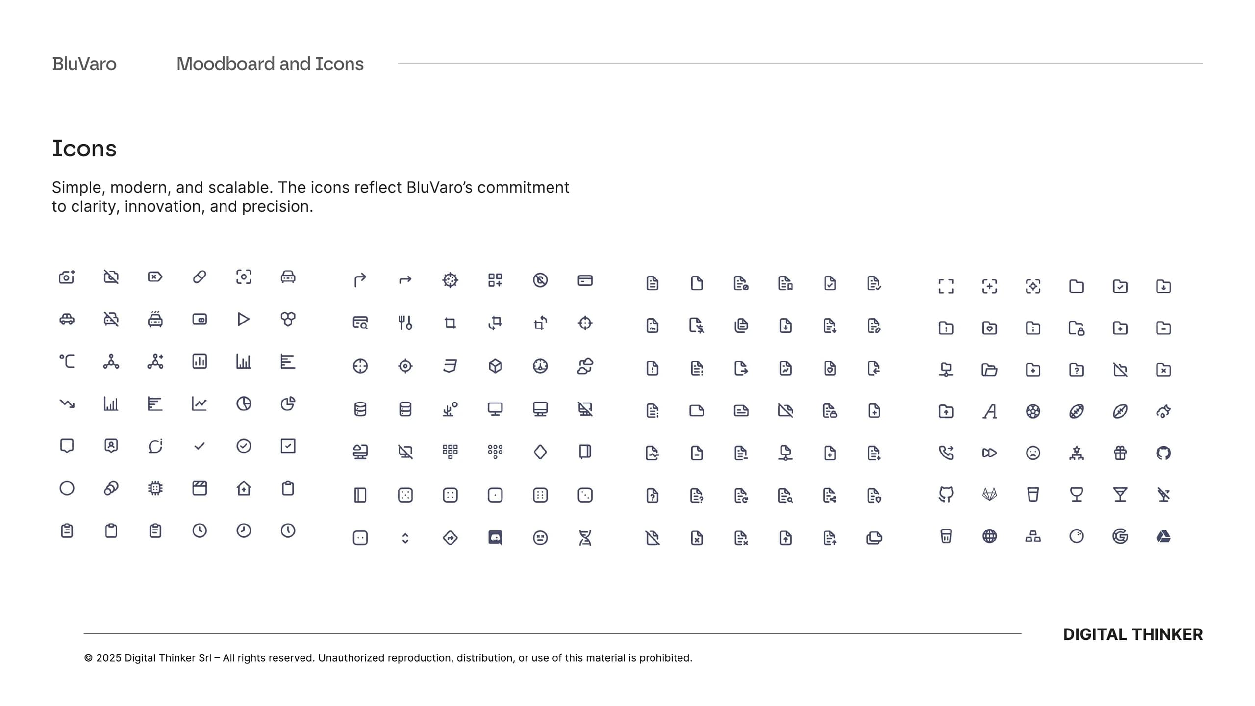
Borna defines the main voice, while Inter guarantees versatility in content and interfaces. A simple, modern and scalable icon library completes the system and allows to explain services, data and processes with continuity.
An identity works when others can use it well.
The brand manual translates the project into repeatable decisions. Variants, rules of use, colour proportions and application examples make the system accessible to teams, partners and suppliers without turning it into a cage.
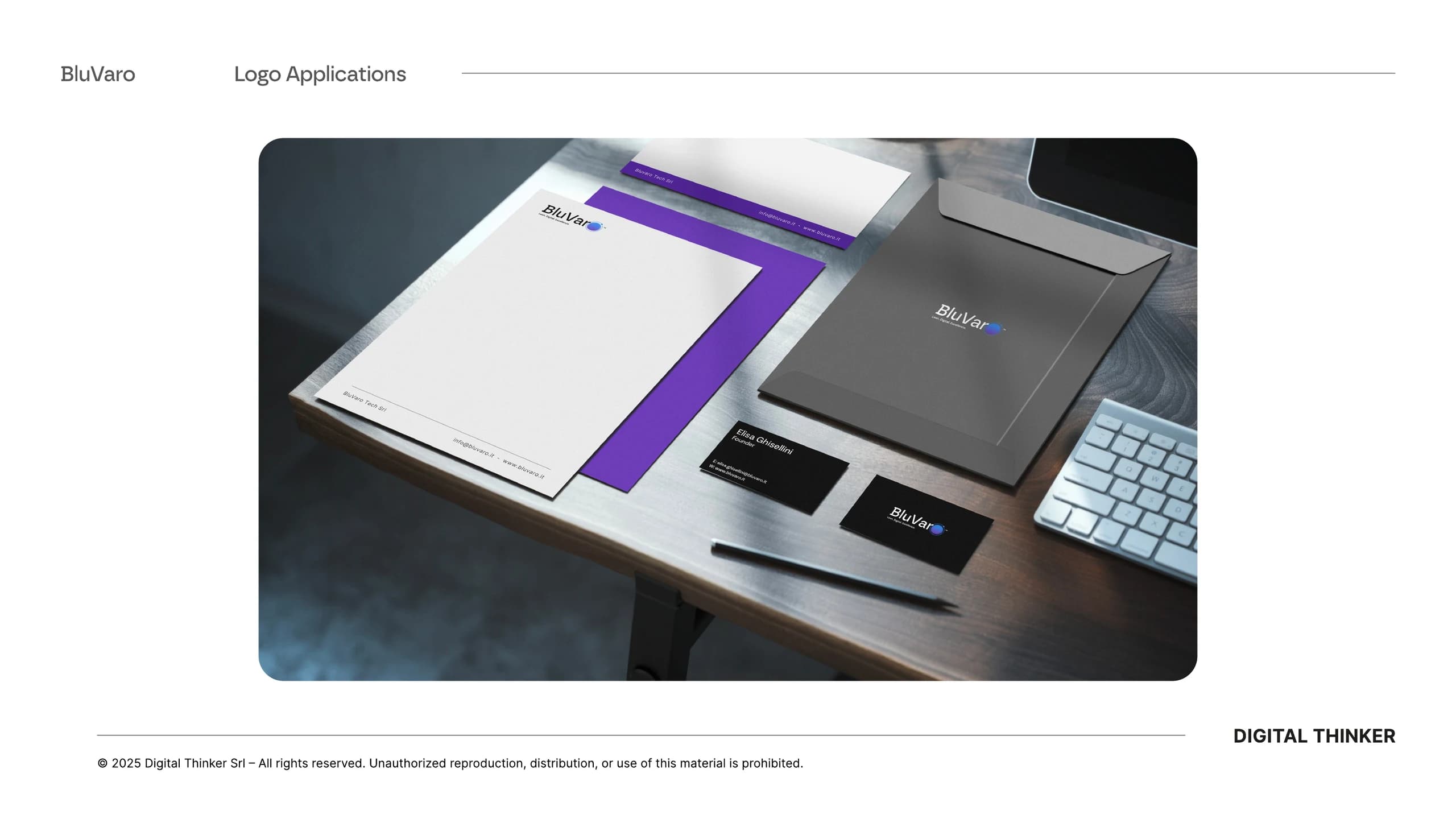
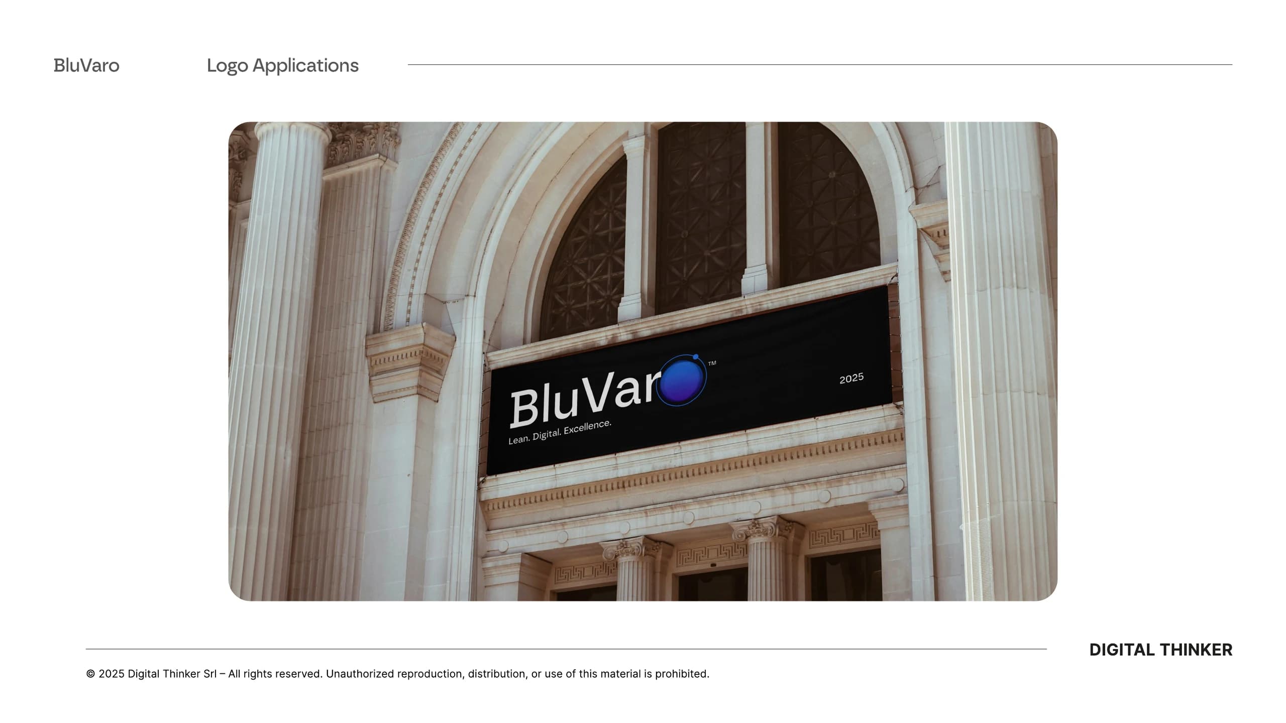
From stationery to presence in spaces, each application retains the same relationship between industrial precision and technological imaginary. Consistency arises from shared rules, not from repetition of the same composition.
The same identity, even when the format changes.
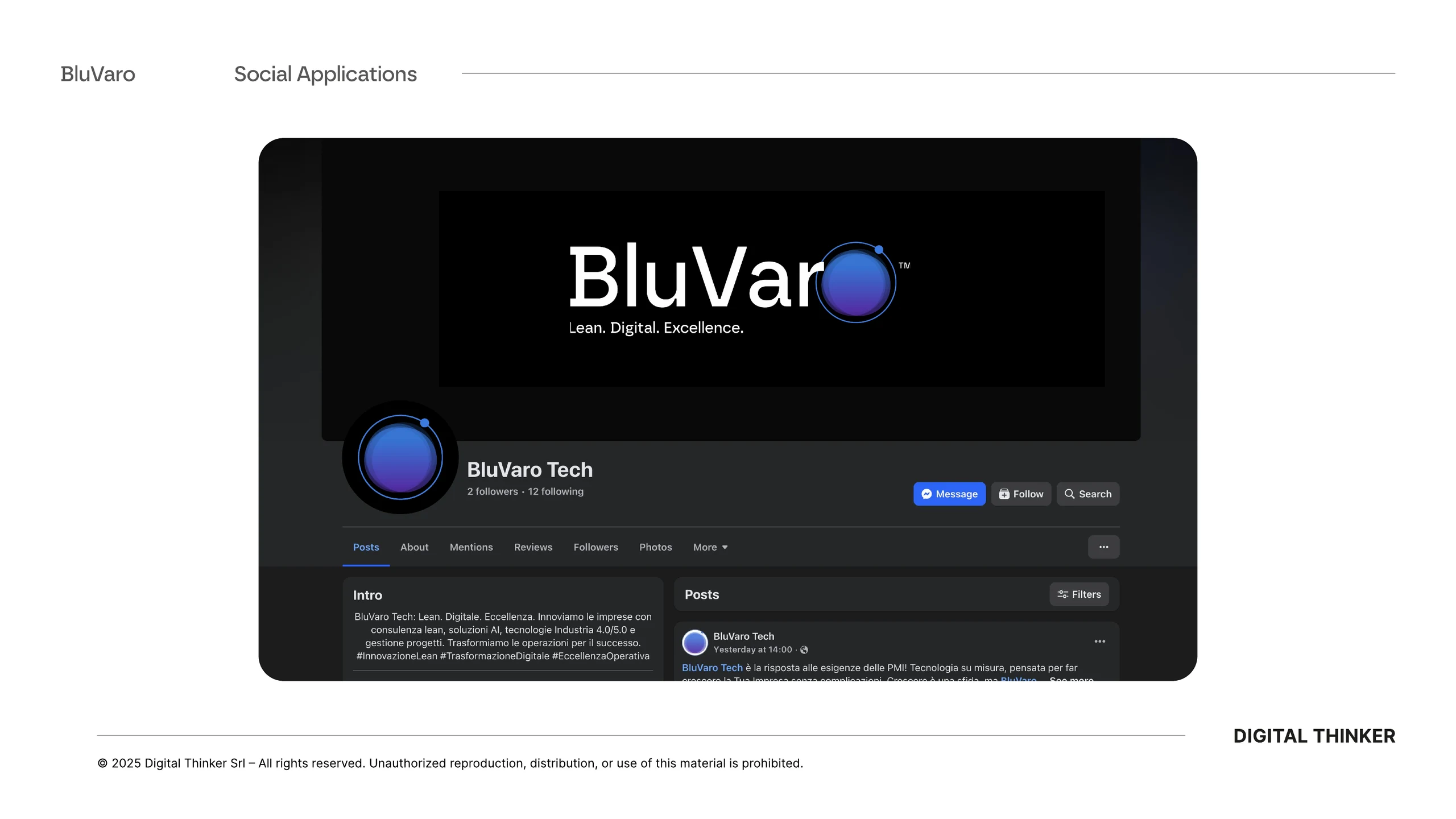
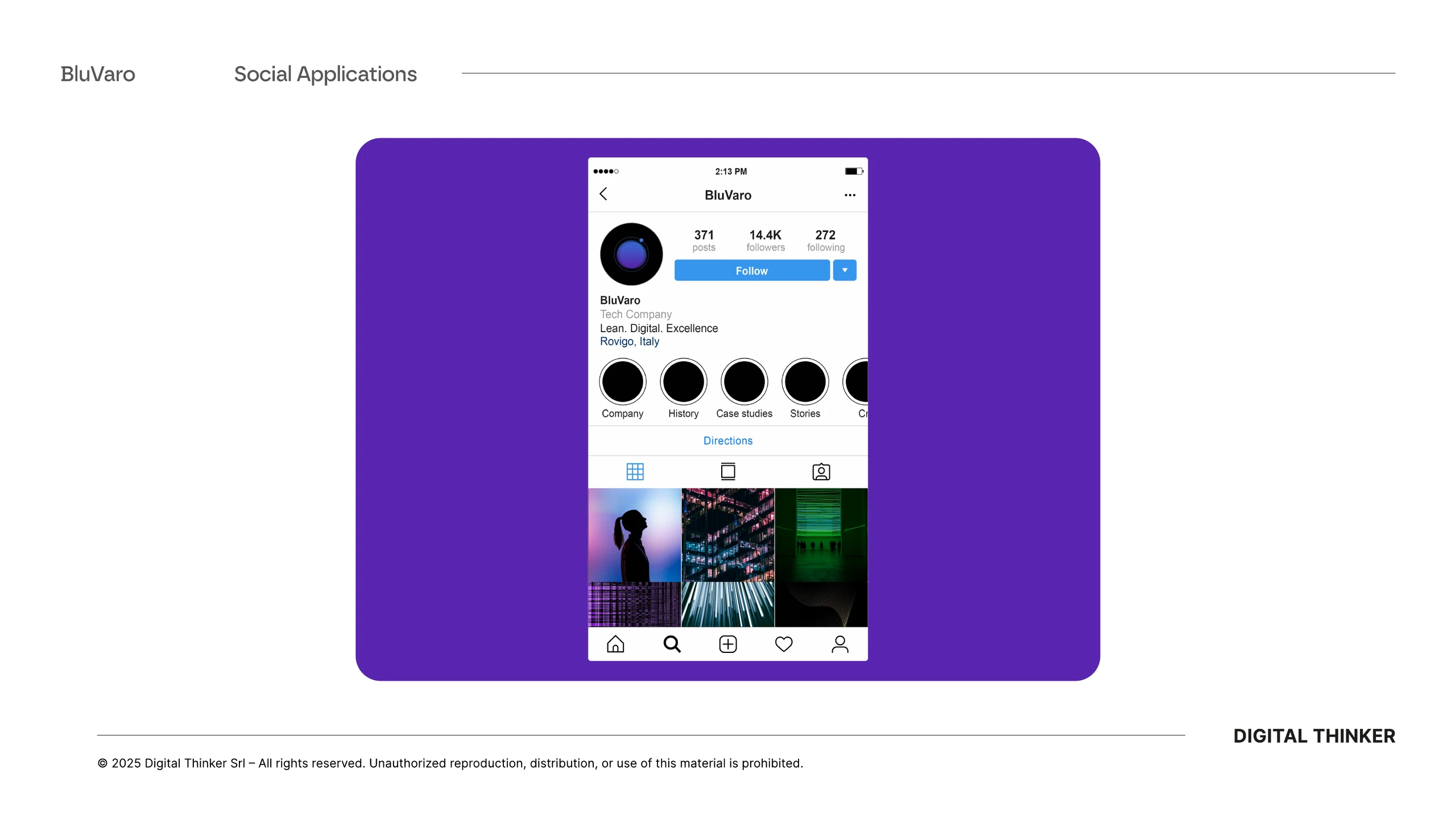
The system has been verified on social channels and digital formats, where the brand must live with interfaces, images and amounts of text not always controllable. Icons and palettes allow to build recognizability even in the smallest spaces.
Profiles, covers and content maintain a consistent voice without becoming uniform. BluVaro has a base ready to grow together with the services, business initiatives and future communication.
From positioning to tools
A recognizable sign. A system ready to evolve.
BluVaro can tell lean manufacturing, innovation and AI with a unique voice, maintaining precision and recognisability in every application.
Lean · Digital · Excellence
Visible positioning
The payoff becomes the narrative structure that connects method, technology and result.
O → orbit
Owner's check
The last letter generates an autonomous, dynamic and immediately recognizable icon.
A rule, many formats
Applicable system
Manuals, palettes, typography and components allow the brand to live between printing, environments and digital.
Continue with
Mariscope
Let’s build something useful.