Project
Essea
Brand identity, art direction and photographic production to give Essea a natural, intimate and immediately recognizable language.
Client
Essea Bio
Period
2020–2021
Category
Branding · Content production
Brand identity and content production
The mark builds character. Images give it a presence.
For Essea we have designed an essential, organic and measured identity. The radial pictogram recalls the vitality of nature without describing it in a literal way; the logo introduces a softer and more editorial presence.
The manual makes the system applicable. Art direction and photography bring it into a real world of skin, light, gestures and time for oneself. Identity and imagery work together without depending on a single packaging design.
Ambito
Brand identity
Directorate
Art direction beauty
Production
163 photos
Output
Manual and archive images
Period
2020–2021
A radial movement meets a more intimate logotype.
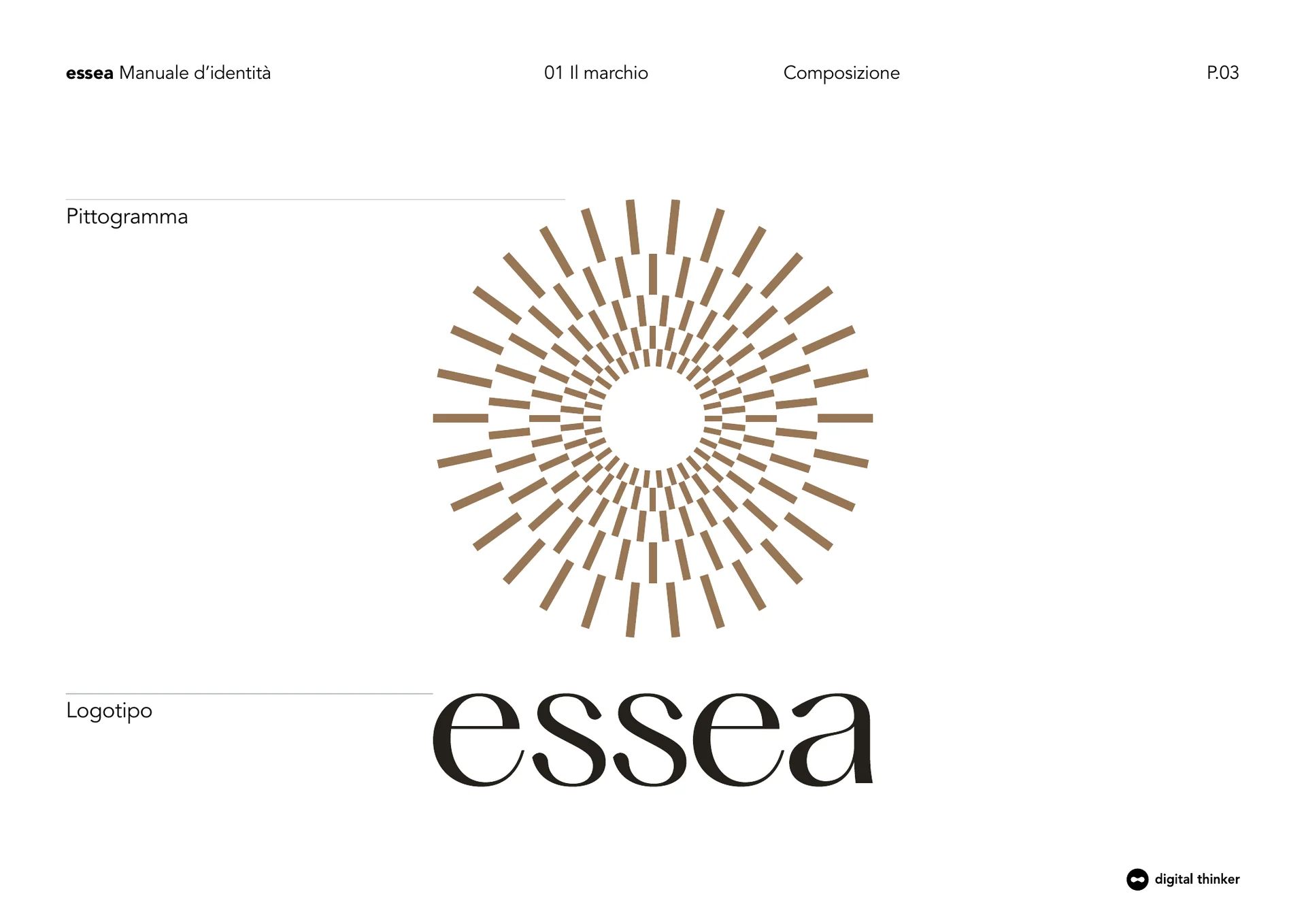
The pictogram is built as a sequence of concentric rays: a live, open and recognizable sign that suggests energy, growth and diffusion. Geometry avoids a naturalistic representation and makes the symbol autonomous.
The logo balances this energy with a calmer pace. The relationship between the two parts builds a contemporary brand without becoming cold, delicate without being fragile.
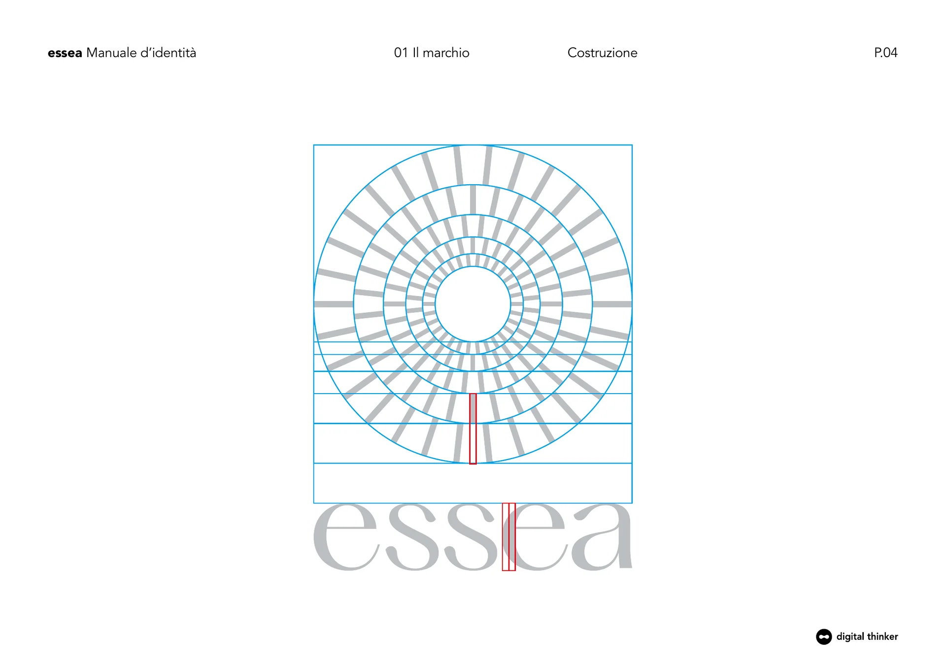
Rules protect recognisability without stiffening it.
Area of respect, reductions, chromiums and typography transform the brand into an operating tool. Each rule comes from the proportions of the system and allows to maintain quality even when changing size, scale and contrast.
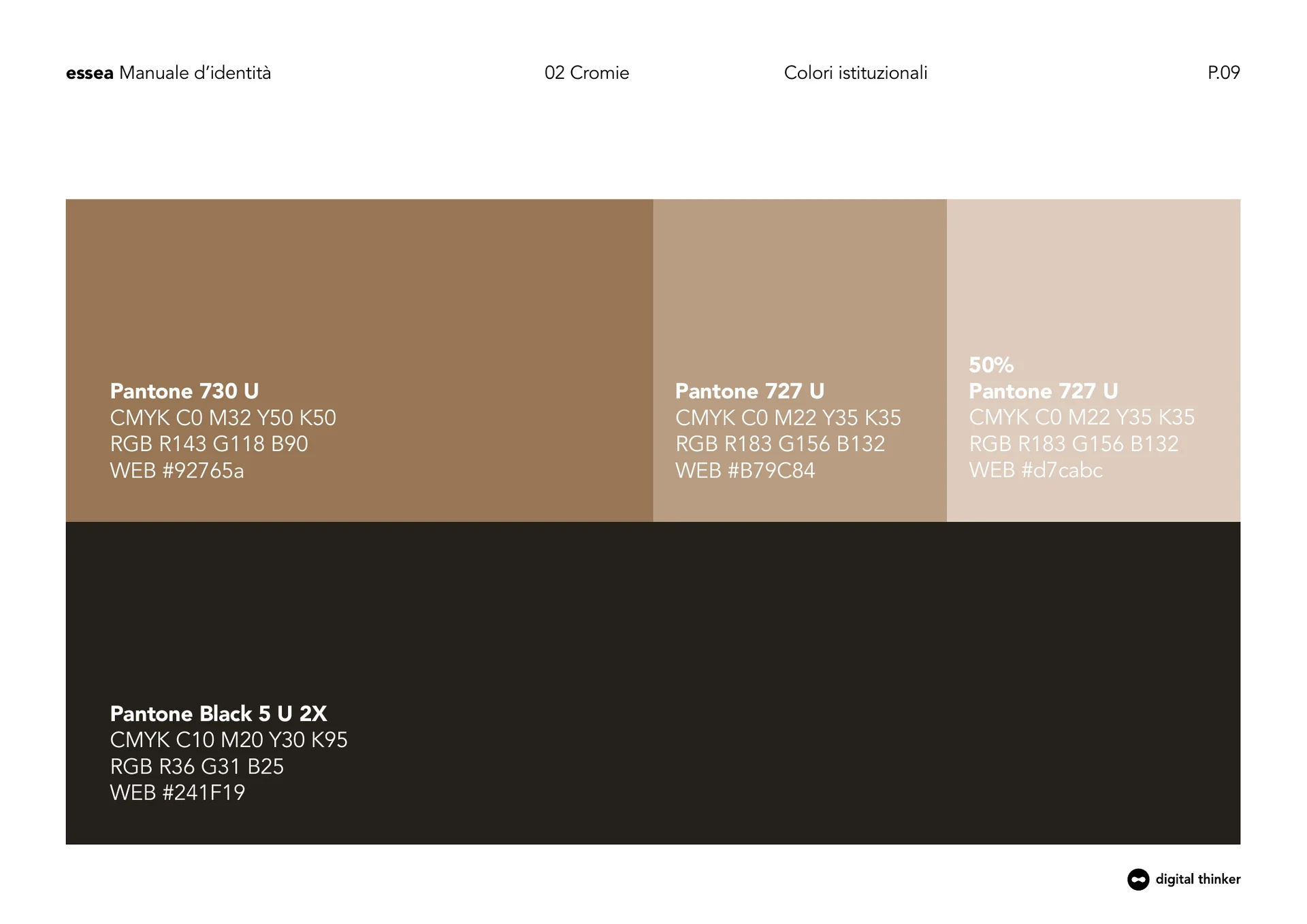
The palette combines warm and material tones with deeper neutrals. The typographical family completes the brand's voice with an editorial character capable of supporting different hierarchy and content.
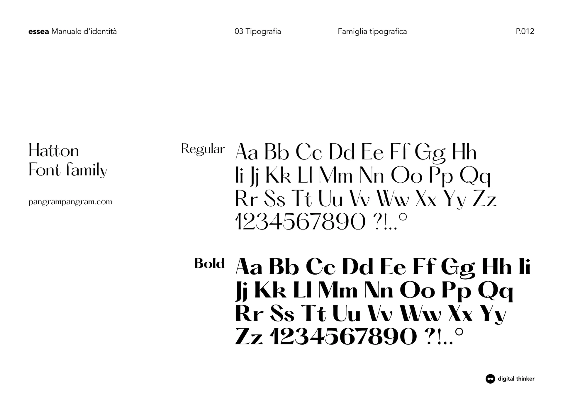
Before shooting we designed light, matter and silence.
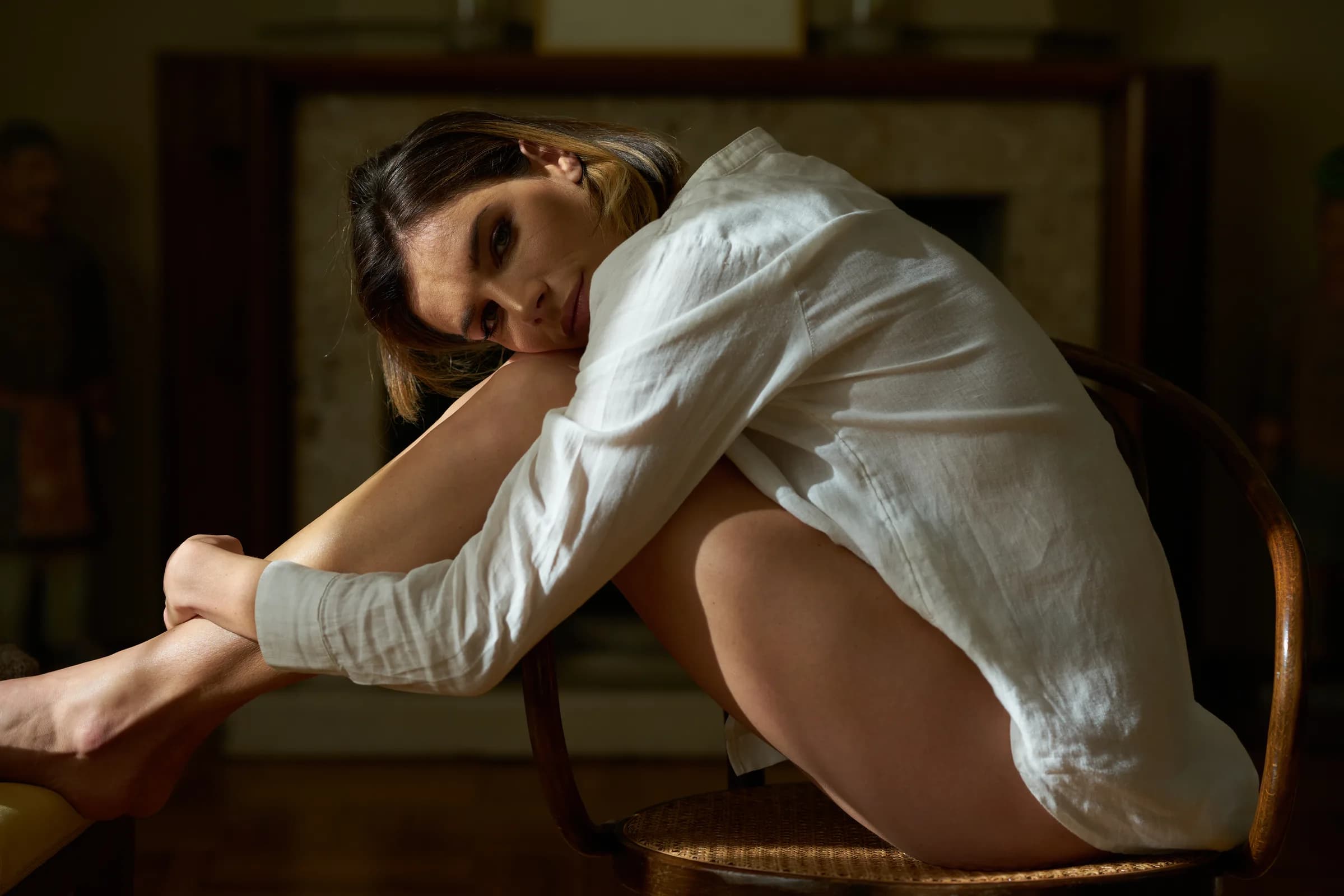
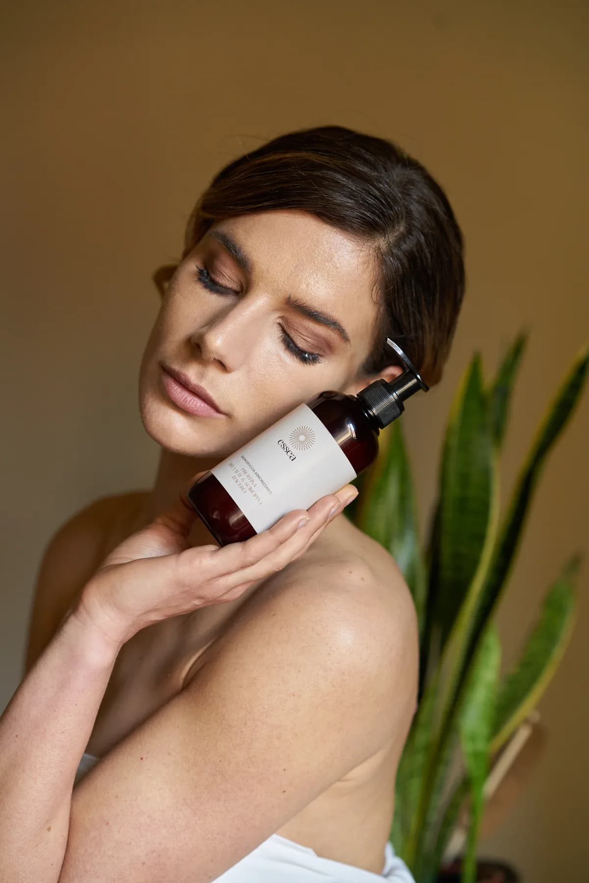
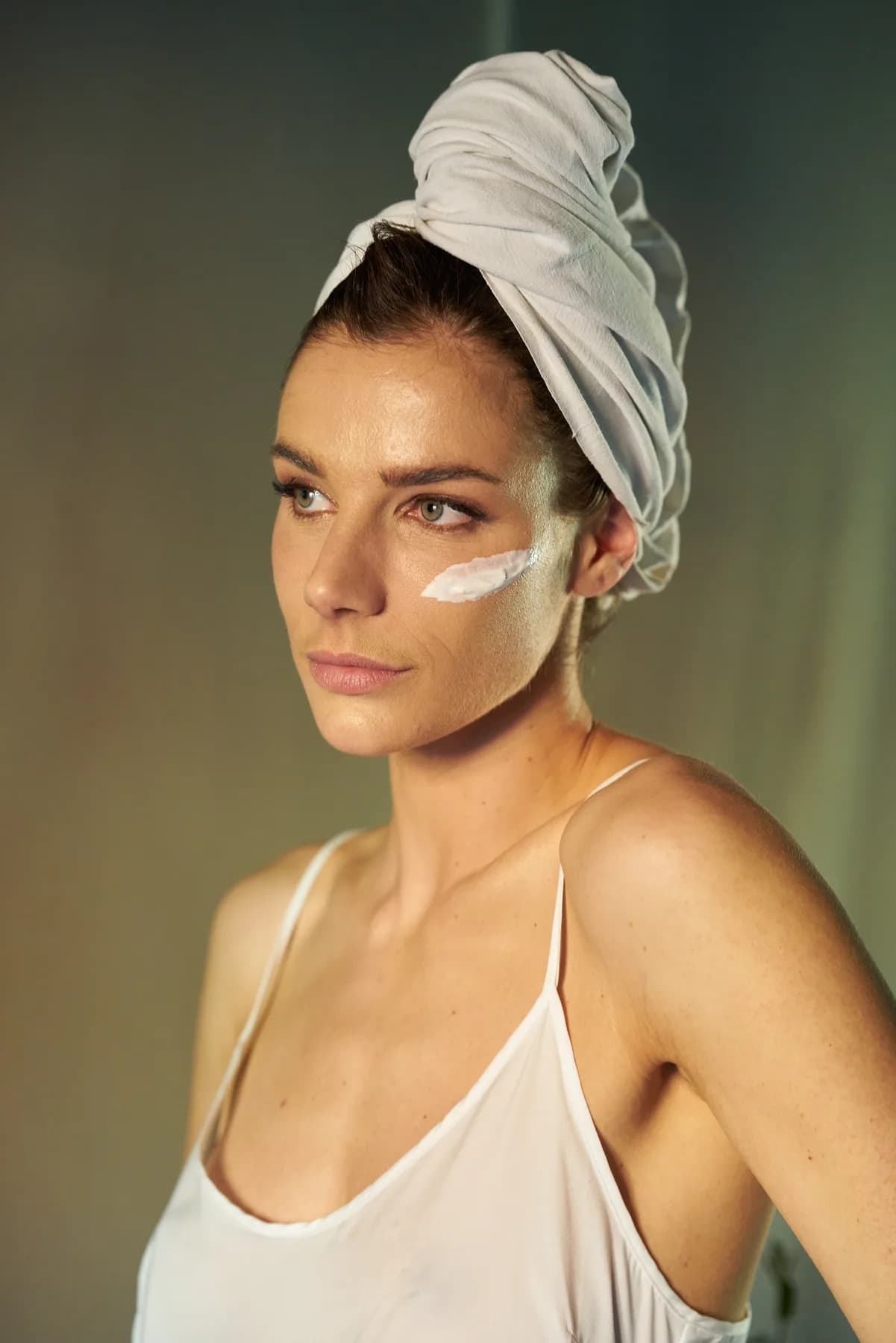
The photograph had to return a feeling of intimacy, real skin and time dedicated to itself. Environmental, styling, gestures and natural light build a warm and sophisticated world, far from both clinical aesthetics and artificial luxury rhetoric.
The model passes through different moments of the same story. Net shadows, reflections, plants, fabrics and domestic surfaces allow the brand to remain recognizable even when the product is not present.
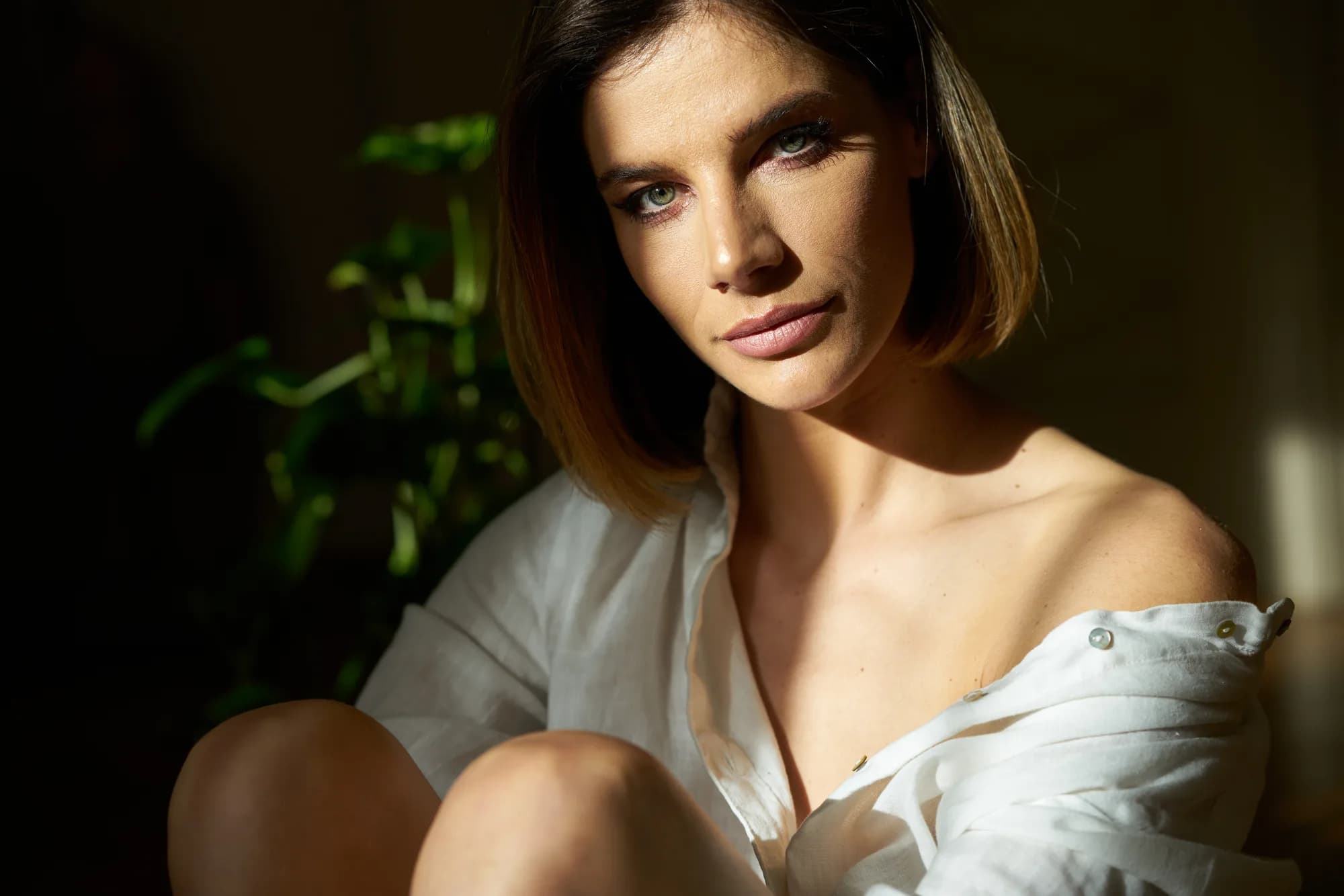

Well-being comes into gestures, not in poses.
The shooting alternates contemplative portraits, everyday movements and closer details. The scene is not treated as a demonstration: every photograph suggests a personal relationship with body care.
This choice makes images usable as hero, editorial content and social communication. Even without showing a packaging, atmosphere and visual direction continue to tell Essea.
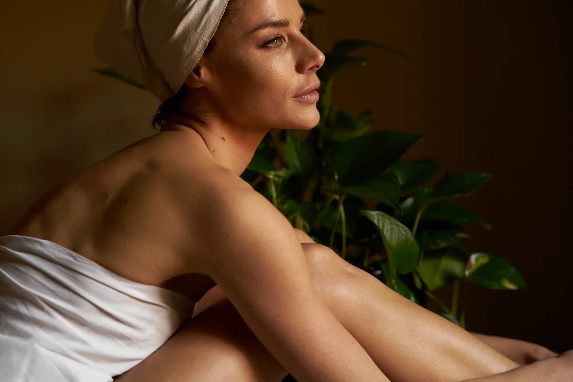
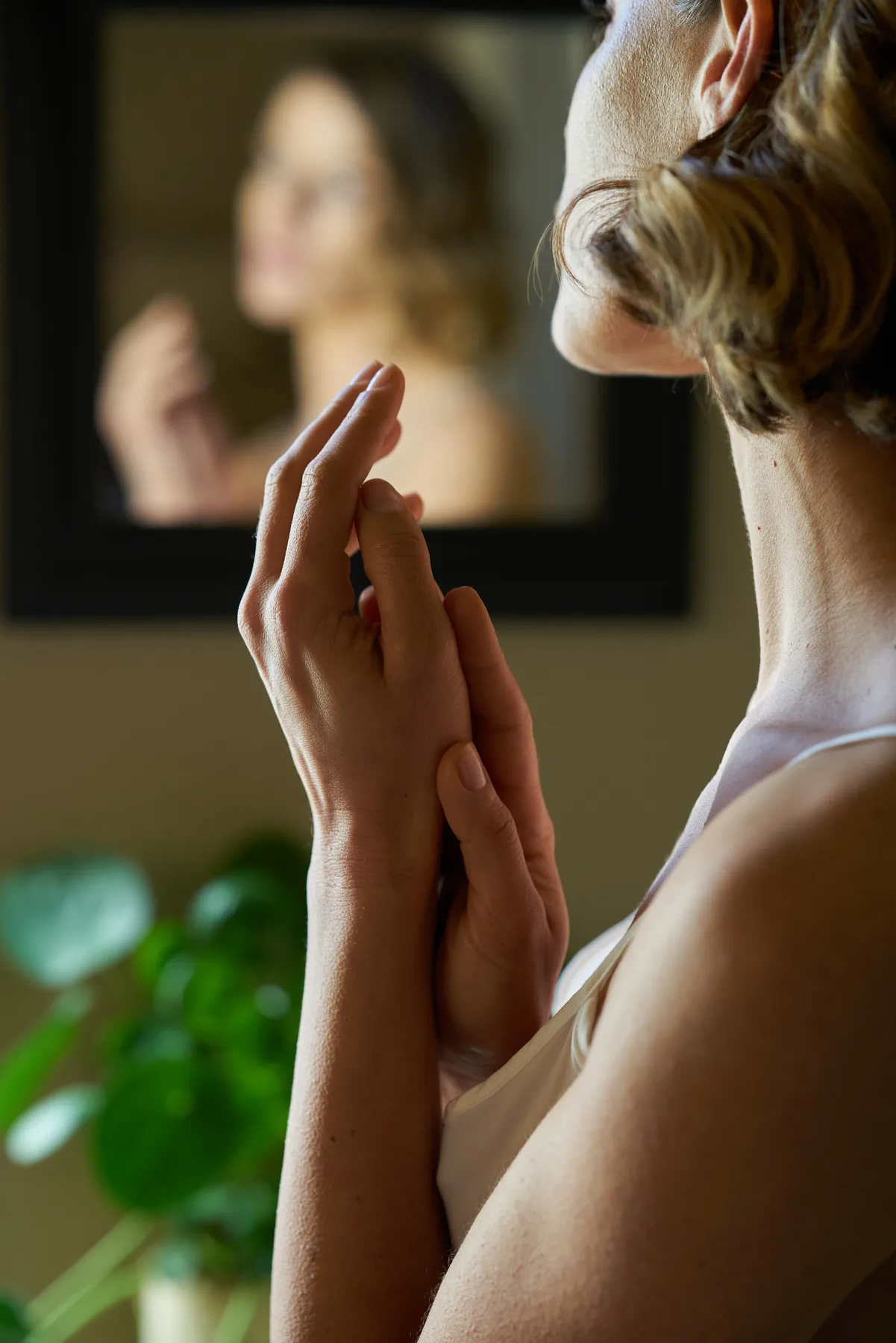
The presence of the product never interrupts the person.
When the product enters the frame it remains part of the gesture: near the face, in the hands, inside the ritual. It is never an object isolated from the world that identity has built.
Portraits, horizontal, vertical formats, scenes of use and more natural moments form a modular archive. The brand can thus power different channels and content while maintaining visual continuity.
An identity that can be lived
From sign to look. From the look to the relationship.
The project continuously puts the brand grammar and the way it is perceived through images.
1 system
Coordinated identity
Mark, color, typography and photography share the same direction.
163 shots
Ownership Archive
Portraits, gestures and lifestyle scenes feed different formats and channels.
1 language
Person in the center
The product only appears when it is part of a gesture or ritual.
Continue with
Federico Fashion Style
Let’s build something useful.